Context & Problem
Florida Blue members were facing unnecessary friction at the most critical touchpoint in their insurance relationship: paying their premiums. The existing payment experience was fragmented and opaque. Members couldn't easily see a comprehensive view of what they owed, billing breakdowns were unclear, and paying through a preferred channel felt unnecessarily complicated.
The consequences were direct and measurable. Confusing billing led to late payments, which led to coverage lapses, which led to customer churn. Members were calling support to understand charges they should have been able to parse on their own. For a health insurer serving millions, even small improvements in payment clarity would compound into significant retention and operational gains.
My Role & Scope
I served as UI/UX Designer responsible for the end-to-end payment flow and billing experience. This covered billing summary design, multi-channel payment workflows, account visibility, and a Cost Comparison Tool that helped members evaluate provider pricing. I collaborated closely with business analysts, the development team, and stakeholders who understood the regulatory and operational constraints of health insurance billing.
Constraints
- Payment channel diversity: Members expected to pay online, by phone, through bank accounts, or via credit card. The experience had to accommodate all channels while maintaining a unified billing view across each.
- Regulatory compliance: Health insurance billing carries strict requirements around data visibility, payment processing, and audit trails. Every design decision needed to pass compliance review before implementation.
- Legacy system integration: The new payment experience had to work with existing backend billing systems that weren't designed for the level of transparency we were introducing to members.
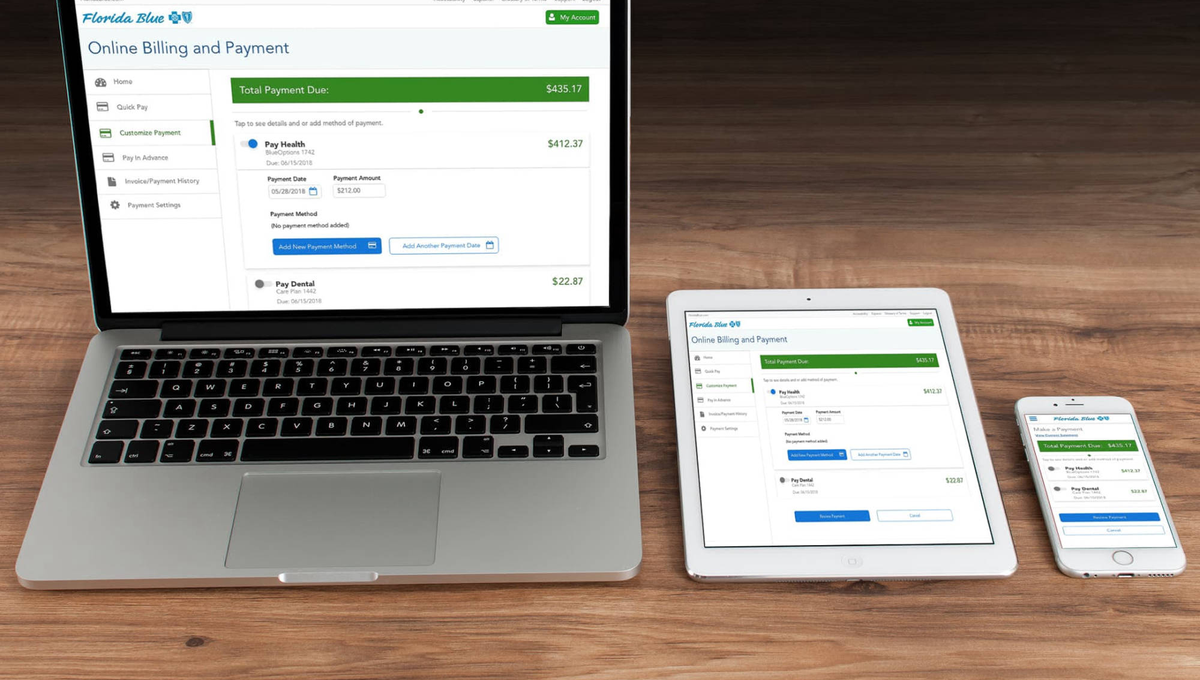
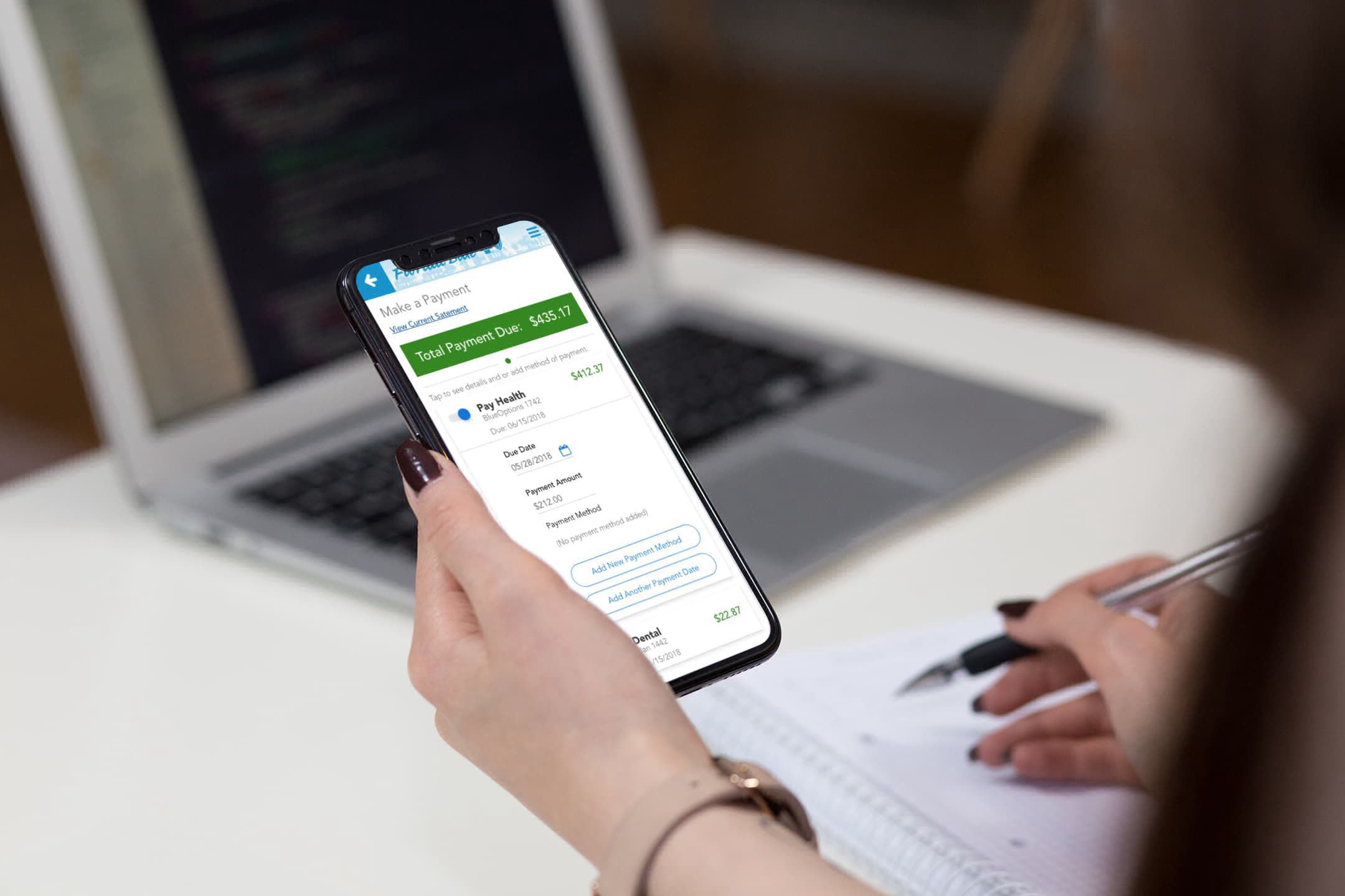
- Responsive delivery: Members needed full payment capability across desktop, tablet, and mobile. The billing breakdown and payment flows had to remain clear and functional at every viewport.
Process & Key Decisions
1. Understanding before transaction
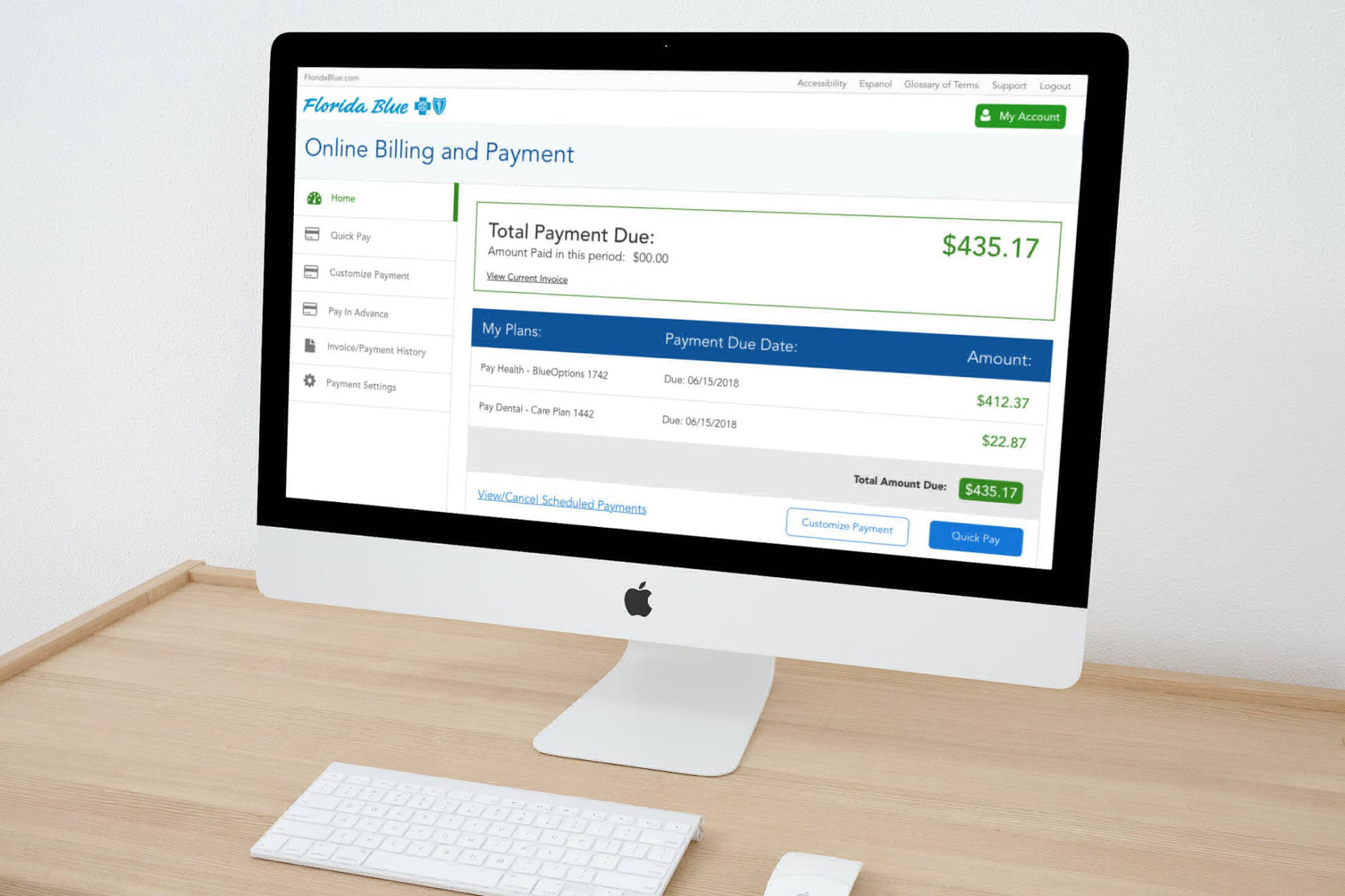
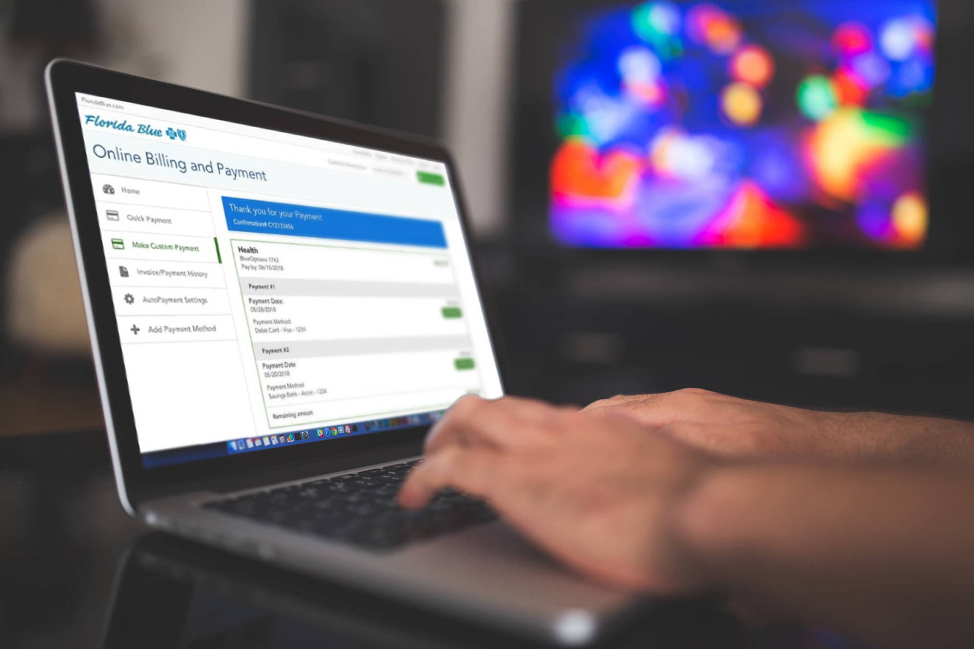
The core design principle: members need to understand what they owe before they can pay with confidence. I designed a comprehensive billing summary that broke down charges by category, highlighted past-due amounts, and displayed payment history, all presented before the payment action. A payment button is meaningless if the member doesn't trust the number next to it.
2. Multi-channel payment as a unified flow
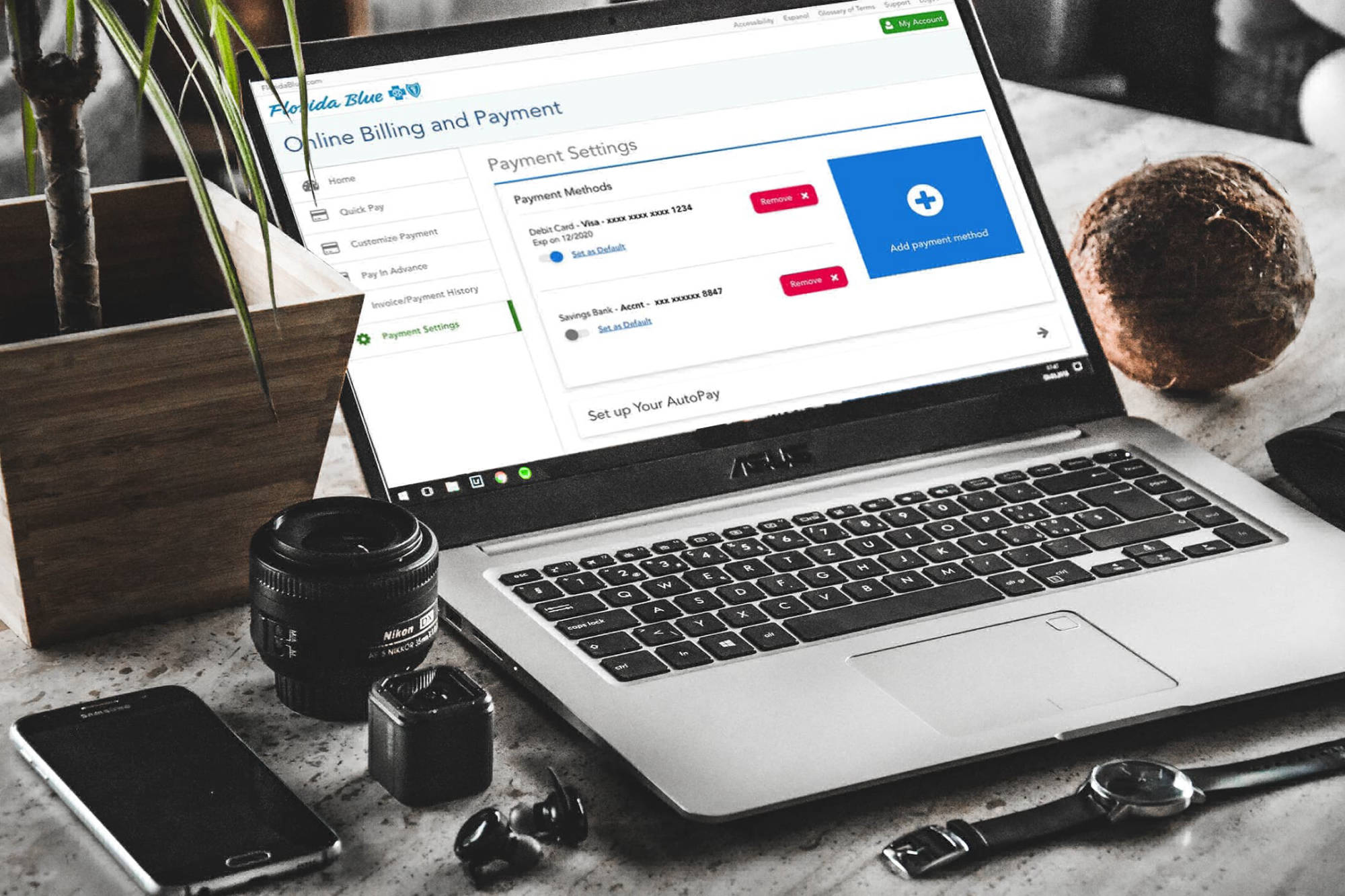
Rather than treating each payment channel as a separate experience, I designed a single payment flow where channel selection was a step, not a fork. Members chose their method within a consistent interface, reducing cognitive load and ensuring the billing context carried through regardless of how they chose to pay.
3. Comprehensive account visibility
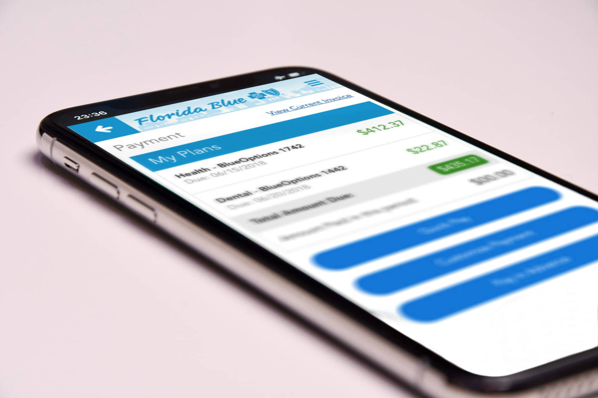
Members previously had to piece together their account status from multiple screens. I consolidated premium details, payment history, upcoming due dates, and account alerts into a single dashboard view. This gave members the full picture at a glance and reduced the most common support call: "What do I owe?"
4. Cost Comparison Tool
Beyond billing, I designed a Cost Comparison Tool that let members evaluate provider pricing for upcoming treatments and prescriptions using search parameters. This extended the self-service principle beyond payments into proactive cost management, giving members a reason to engage with the portal beyond bill-pay.
What Changed
A transparent billing summary replaced opaque charge screens, breaking down premiums by category with clear past-due indicators and payment history
A unified multi-channel payment flow let members pay via bank account, credit card, phone, or online through a single consistent interface
A consolidated account dashboard gave members a complete view of their financial relationship with Florida Blue in one place
A Cost Comparison Tool enabled members to proactively evaluate provider and prescription pricing before committing to care
Selected Work

Outcome & Impact
The redesigned payment experience delivered measurable improvements across member engagement and operational efficiency:
- Improved payment completion rates: Transparent billing summaries and a streamlined payment flow reduced friction at the point of transaction. Members who understood their charges were significantly more likely to complete payment.
- Reduced support call volume: Self-service access to billing breakdowns and account status addressed the most common member inquiries without requiring phone-based support.
- Multi-channel adoption: The unified payment flow made it easy for members to use their preferred channel, increasing overall payment flexibility without fragmenting the experience.
- Proactive cost management: The Cost Comparison Tool gave members a new reason to engage with the portal, extending the platform's value beyond reactive bill-pay into active healthcare cost planning.
Lessons Learned
Clarity is the prerequisite for conversion
The single most impactful design decision was presenting billing information before the payment action. Users don't act when they're confused. Removing ambiguity from the billing summary had a direct, measurable effect on payment completion.
Channel diversity doesn't require experience fragmentation
Supporting multiple payment methods could have meant multiple flows. By treating channel selection as a step within a unified flow rather than a separate path, the experience stayed consistent and the design stayed maintainable.
Self-service reduces cost only if it builds trust
Moving members to self-service only works if the self-service experience is more trustworthy than the phone call it replaces. Every element of the billing UI was designed to earn that trust through transparency and accuracy.